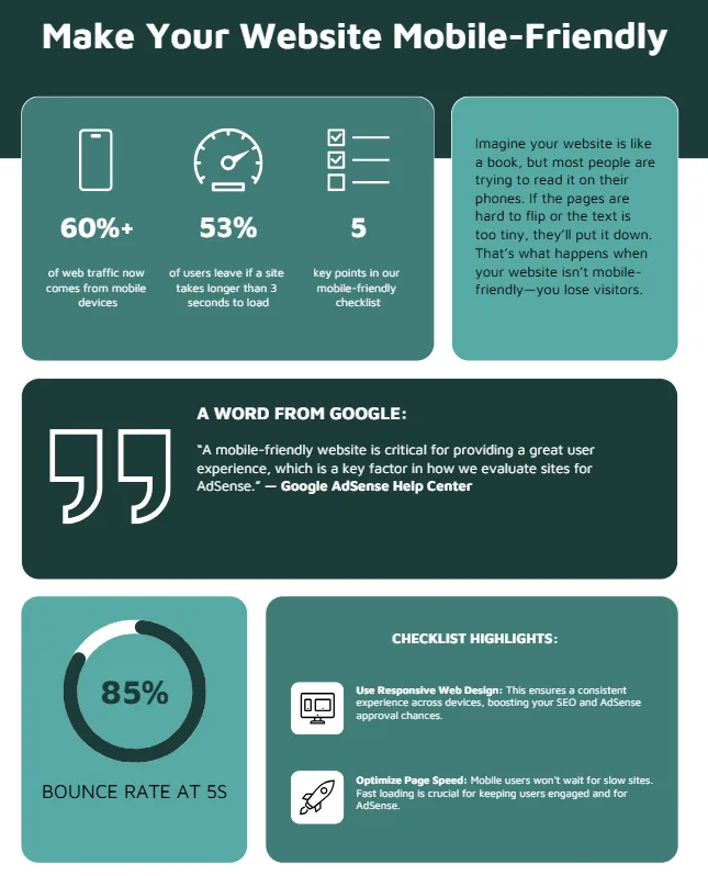
Imagine your website is like a book in a library, but most people are trying to read it on their phones. If the pages are hard to flip or the text is too tiny, they’ll put it down and grab another book. That’s what happens when your website isn’t mobile-friendly—you lose visitors, and Google might push your site lower in search results.
With over 60% of web traffic coming from mobile devices, a mobile-friendly website is a must for bloggers and site owners aiming to get approved for Google AdSense and rank high on search engine results pages (SERPs). This article gives you a simple 5-point checklist to make your site mobile-friendly, boost user experience, and increase your chances of AdSense approval.
What Is a Mobile-Friendly Website?
A mobile-friendly website adjusts its layout, text, and images to work smoothly on smartphones and tablets. Think of it like a stretchy t-shirt that fits perfectly whether you’re big or small—it adapts to any screen size. Google uses mobile-first indexing, meaning it looks at your mobile site first to decide your search ranking. A mobile-friendly site loads fast, is easy to navigate, and shows the same content as your desktop version. This is key for user experience and for getting approved for Google AdSense, which rewards sites that follow Google’s mobile-friendly guidelines.
“A mobile-friendly website is critical for providing a great user experience, which is a key factor in how we evaluate sites for AdSense.”
— Google AdSense Help Center
Why Mobile-Friendliness Matters for AdSense and SEO
Here’s the deal: Google wants websites to be easy to use on phones because most people browse that way. If your site isn’t mobile-friendly, users might leave quickly, which Google calls a “high bounce rate.” This hurts your SEO and can lead to AdSense rejection, as Google prioritizes sites with great user experiences. A mobile-friendly site also loads ads properly, which means more clicks and revenue. Plus, with mobile-first indexing, Google ranks your mobile site first, so optimizing it is like giving your site a VIP pass to the top of search results.
“Mobile-first indexing means Googlebot will now use the mobile version of your site for indexing and ranking to better help mobile users find what they’re looking for.”
— Google Search Central Blog
5-Point Mobile-Friendly Website Checklist
Let’s break down a simple checklist to make your website mobile-friendly. Each step is like a building block to create a site that Google loves and users enjoy.
1. Use Responsive Web Design
What It Is: Responsive web design is like a magic puzzle that rearranges itself to fit any screen size. It uses the same HTML code for desktops, tablets, and phones but adjusts the layout using CSS.
Why It Matters: Google recommends responsive design because it’s easy to maintain and ensures a consistent experience across devices. This boosts your SEO and makes your site more likely to get AdSense approval.
How to Comply: Use a responsive framework like Bootstrap or a WordPress theme like Astra. Test your site on different devices to make sure images, text, and buttons adjust automatically.
Practical Application: Add this CSS code to make images scale properly on mobile:
<img src="example.jpg" style="max-width: 100%; height: auto;">
“Responsive design is the simplest way to reach users across devices and the approach we recommend for mobile-first indexing.”
— Google Web Fundamentals
2. Ensure Content Parity
What It Is: Content parity means your mobile site has the same text, images, and videos as your desktop site. It’s like serving the same meal at two different restaurants—no one gets shortchanged.
Why It Matters: If your mobile site hides content to “simplify” the design, Google might miss it during indexing, hurting your rankings. AdSense also checks for consistent content to ensure ads display correctly.
How to Comply: Compare your mobile and desktop sites. Make sure all blog posts, images, and links appear on both. Avoid using “mobile-only” versions that cut out key content.
Practical Application: Use Google’s Mobile-Friendly Test tool (available in Google Search Console) to check if your mobile site matches your desktop version.
3. Optimize Page Speed
What It Is: Page speed is how fast your site loads on a phone. Think of it like a racecar—faster is always better.
Why It Matters: Mobile users won’t wait for slow sites. Google says 53% of users leave if a site takes longer than 3 seconds to load. Slow sites hurt SEO and AdSense approval since ads need to load quickly too.
How to Comply: Compress images using tools like TinyPNG, minify CSS and JavaScript, and use a fast hosting provider. Test your speed with Google’s PageSpeed Insights.
Practical Application: Enable lazy loading for images to speed up your site:
<img src="example.jpg" loading="lazy" alt="Example Image">
“Site speed is a ranking factor, and a fast mobile experience is crucial for keeping users engaged and earning through AdSense.”
— John Mueller, Google Search Advocate
4. Make Navigation Easy
What It Is: Easy navigation means users can tap buttons and links without zooming or struggling, like following a clear map.
Why It Matters: If users can’t find what they need, they’ll leave, increasing your bounce rate. Google checks navigation for AdSense approval to ensure a good user experience.
How to Comply: Use large, tappable buttons (at least 48×48 pixels) and a simple menu. Avoid pop-ups that block content on mobile.
Practical Application: Add a hamburger menu for mobile users:
<button class="menu-toggle">☰ Menu</button>
<style>
.menu-toggle { font-size: 24px; padding: 10px; }
</style>
5. Add Structured Data
What It Is: Structured data is like a label on a package that tells Google what’s inside your site, like articles or products. It uses schema markup to make your content clear.
Why It Matters: Structured data helps Google understand your mobile site, improving your chances of ranking higher. It’s also important for AdSense, as it ensures ads match your content.
How to Comply: Add schema markup using JSON-LD. Test it with Google’s Structured Data Testing Tool to ensure it’s the same on mobile and desktop.
Practical Application: Add FAQ schema to your blog:
<script type="application/ld+json">
{
  "@context": "https://schema.org",
  "@type": "FAQPage",
  "mainEntity": [{
    "@type": "Question",
    "name": "How do I make my site mobile-friendly?",
    "acceptedAnswer": {
      "@type": "Answer",
      "text": "Use responsive design, ensure content parity, optimize speed, simplify navigation, and add structured data."
    }
  }]
}
</script>
Comparison of Mobile-Friendly Tools: A Feature Breakdown
| Tool Name | Key Feature | Best For | Price/ROI | Cons/Issues |
|---|---|---|---|---|
| Google Mobile-Friendly Test | Checks mobile usability | Beginners checking compliance | Free / High ROI | Limited to basic checks |
| PageSpeed Insights | Analyzes load speed | Optimizing performance | Free / High ROI | Requires technical fixes |
| Google Search Console | Monitors mobile errors | Tracking ongoing issues | Free / High ROI | Steep learning curve |
| Bootstrap Framework | Responsive design templates | Building mobile-friendly sites | Free / High ROI | Requires CSS knowledge |
| TinyPNG | Compresses images for faster loading | Improving page speed | Free or Paid / High ROI | Paid version for bulk processing |
This table helps you pick the right tools to make your site mobile-friendly, balancing ease of use and impact on AdSense approval.
How to Test and Improve Your Mobile-Friendly Site
Here’s a quick checklist to test and improve your site:
- Run Google’s Mobile-Friendly Test: Go to Google Search Console and enter your URL. Fix any errors it flags, like text too small or blocked resources.
- Check Page Speed: Use PageSpeed Insights to get a score and suggestions. Aim for a load time under 3 seconds.
- Test on Real Devices: View your site on different phones and tablets to ensure buttons and menus work smoothly.
- Monitor Search Console: Check for mobile usability errors weekly to catch issues early.
- Update Regularly: Keep your site’s plugins, themes, and content updated to stay compliant with Google’s standards.
Mobile-Friendly Chart: Page Load Time Impact
Below is a chart showing how page load time affects bounce rates, which impact SEO and AdSense earnings.
“`htmlMonetization Impact of a Mobile-Friendly Site
A mobile-friendly site directly boosts your AdSense earnings. Ads load faster and display correctly, leading to more clicks. Google’s algorithms favor mobile-friendly sites, so you’ll get more traffic from higher rankings. For example, a site with a 2-second load time can have a 30% bounce rate, while a 5-second load time spikes to 85% (see chart above). Lower bounce rates mean more visitors stay, view ads, and increase your revenue. Plus, a mobile-friendly site shows Google you care about user experience, making AdSense approval easier.
Responsive Web Design: The Key to Mobile Success
Responsive web design is the backbone of a mobile-friendly site. It’s like building a house with adjustable walls that fit any family. By using flexible layouts, you ensure your site looks great on any device, which Google rewards with better rankings. Combine this with fast load times and consistent content, and you’re on track to rank #1 on SERPs and get AdSense approval.
Conclusion: Stay Ahead with a Mobile-Friendly Site
So, what’s the bottom line? A mobile-friendly website is your ticket to better SEO, higher AdSense earnings, and happier users. By following this 5-point checklist—using responsive design, ensuring content parity, optimizing speed, simplifying navigation, and adding structured data—you’ll meet Google’s standards and stand out in 2025. Keep testing and updating your site to stay ahead of mobile trends. Start today, and watch your site climb to the top of SERPs!
Frequently Asked Questions (FAQs)
Why does Google prioritize mobile-first indexing?
Google uses mobile-first indexing because over 60% of searches happen on mobile devices. It wants to rank sites that give users a great mobile experience, which also helps AdSense ads perform better.
How can I check if my site is mobile-friendly?
Use Google’s Mobile-Friendly Test in Search Console. It checks for issues like small text or blocked resources and gives you a report to fix them.
Will a mobile-friendly site guarantee AdSense approval?
No, but it’s a big factor. Google looks for user-friendly sites, and mobile-friendliness is a key part of that. Follow the checklist to improve your chances.
What’s the easiest way to make my site responsive?
Use a responsive theme like Astra for WordPress or a framework like Bootstrap. Test it across devices to make sure it adapts well.
How does page speed affect AdSense earnings?
Faster pages keep users on your site longer, increasing ad views and clicks. A slow site raises bounce rates, hurting both SEO and revenue.